Using Data Visualization to Handle the Madness
There is value in being able to quickly “move and shift” data and discover new relationships, dependencies and meaning.
March 16, 2018

Sponsored by Oracle
Much has been written about data visualization (DV) and how it aids in the understanding of numbers. It’s true that we can gain deeper insights when data is in visual form. But are there any other benefits of DV?
How about the dynamic manipulation of data? Yes. I believe there is value in being able to quickly “move and shift” data and discover new relationships, dependencies and meaning. To illustrate this, I created a new project in Oracle Data Visualization that looks at the NCAA Men’s Basketball Tournament.
I found my data on www.teamrankings.com. This website hosts NBA and NCAA basketball data and even provides their own rankings. I figured it’s worth giving them a try during the madness that is ensuing. Here is the spreadsheet I created with their data.
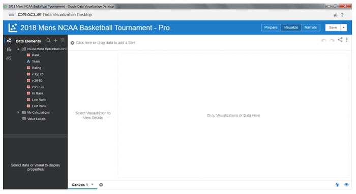
After I uploaded the spreadsheet into DV and started my project, I see the screen below. From here, I can take any number of directions to try and predict the unpredictable.
Let’s say I decide to look at some specific matchups. So, in the South bracket, Virginia is set to play UMBC. I want to dig deeper into this matchup and use the filter function in Oracle DV to see this screen:
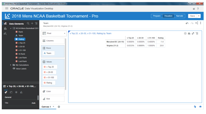
Obviously, Virginia is the heavy favorite. With outstanding records versus top 25 and top 26-50 teams and a perfect record against teams ranked 51-100, Virginia should have no issues getting past the first round. Now let’s look at a different matchup with some visualizations.
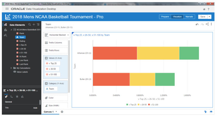
Although this game appears to be a close matchup between a 7th seed and a 10th seed with nearly identical records, if you look at the respective winning percentages against better teams, Arkansas might have an edge. Notice I say “might”. This is the beauty of the Men’s NCAA Tourney: the unpredictability.
Let’s say Butler upsets Arkansas. They would go on to play either Purdue or California State Fullerton.
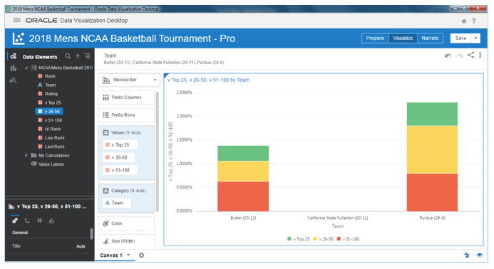
I know who Butler would prefer to play. Because the nature of March Madness is … madness, it’s useful to be able to quickly manipulate the data you are looking for and better understand the entire landscape. You can preview “what-if” scenarios all day long. This is just one useful example of how to use DV.
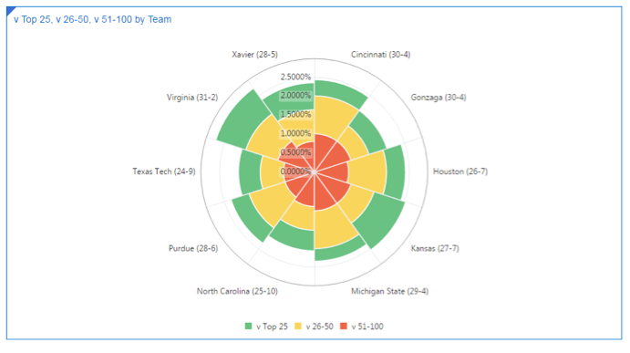
Let’s say I want to filter out the best teams in the entire tournament. I simply change my filters to focus on the winning percentages and not specific teams.
For the graphic below, I focused on teams with a 25 percent or better winning percentage against top 25 teams, a 50 percent or better record against top 26-50 teams, and a 75 percent or better statistic against top 51-100 teams. Here are my favorite teams to win it all:
I hope you found this blog informative and that you make use of the spreadsheet above for your own March Madness research. Better yet, sign-up for a trial version of Oracle DV and create your own visualizations. Also be sure to visit our website and take one our Quick Tours and/or Simulator. You can also find more resources on our Customized Content page.
Life is unpredictable. So are your customers. Changing directions quickly and discovering new perspectives happen on and off the court. Be prepared!
All the best,
Chris Garcia
Product Marketing Director, Cloud GTM BI, Oracle
This guest blog is part of a Channel Futures sponsorship.
You May Also Like
