Rating Open Source Desktop Notification Systems
It’s a problem as old as the microprocessor: How do you provide important information to users without getting in the way of their workflow? On most open source platforms, the answer to this conundrum currently lies in passive notification popups or bubbles. And while some interfaces get it right, others — especially GNOME Shell — could do a lot better. Here’s how.
Traditionally, the Linux world lacked any standardized, centralized system for providing information to users about system or application events. Different distributions and desktop environments implemented various solutions, none of them particularly elegant or memorable.
GNOME 2, for instance, used the “system tray” portion of its panel to display information. That approach was unintrusive, but it also made it easy to miss important notifications. More obnoxiously, Ubuntu used to impress the importance of software updates upon users by periodically injecting the Update Manager into the middle of the screen — a strategy which in many cases, including my own, backfired grandly because it encouraged users to disable the highly intrusive “feature” altogether.
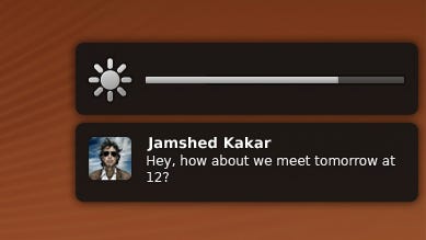
Then, with the release of Ubuntu 9.04 in 2009, Canonical introduced the notify-osd system, which arguably did a decent job of living up to its promise of providing “simple, unintrusive, elegant notifications” like these:

Talking to Users in GNOME Shell and Unity
notify-osd was rapidly adopted by a number of other Linux distributions, and it continues to provide one of the core components of the system for communicating with users in Ubuntu’s new Unity desktop environment. That’s good for people who use Unity.
Since I recently jumped the Ubuntu ship to switch to Linux Mint, however, I no longer run Unity. I use GNOME Shell instead, which, in general, I like better. But one of the things about the interface that continues to irk me are the notifications that appear in the bottom center of the screen whenever I do almost anything. For example:

This approach is silly for several reasons. First, it’s kind of redundant to send notifications for events such as opening up the file browser (which is what I did to generate the notification in the screenshot above) when the window I just opened is also appearing on the desktop in front of me. Does GNOME think I’m not going to remember I opened my Home folder if it doesn’t tell me?
The notifications are also only very slightly transparent, which means they can obscure important information on the screen.
And worst of all, the notifications don’t always go away on their own. Sometimes they require me to click on them or complete an action before they’ll evanescence. That interrupts workflow.
To be fair, the GNOME Shell notifications have some positive points. They are not aesthetic disasters — although they could be a little prettier — and they adequately perform the basic job of communicating information. They’re magnitudes better than, say, the grungy old Windows XP popup bubbles.
But from my perspective, the notification interface is a front where GNOME still has a lot of room for improvement. And since I’m grudgingly accepting GNOME Shell as my new de facto desktop, I hope this area will improve in the months and years to come.
About the Author
You May Also Like


